Market Analyse & Insight
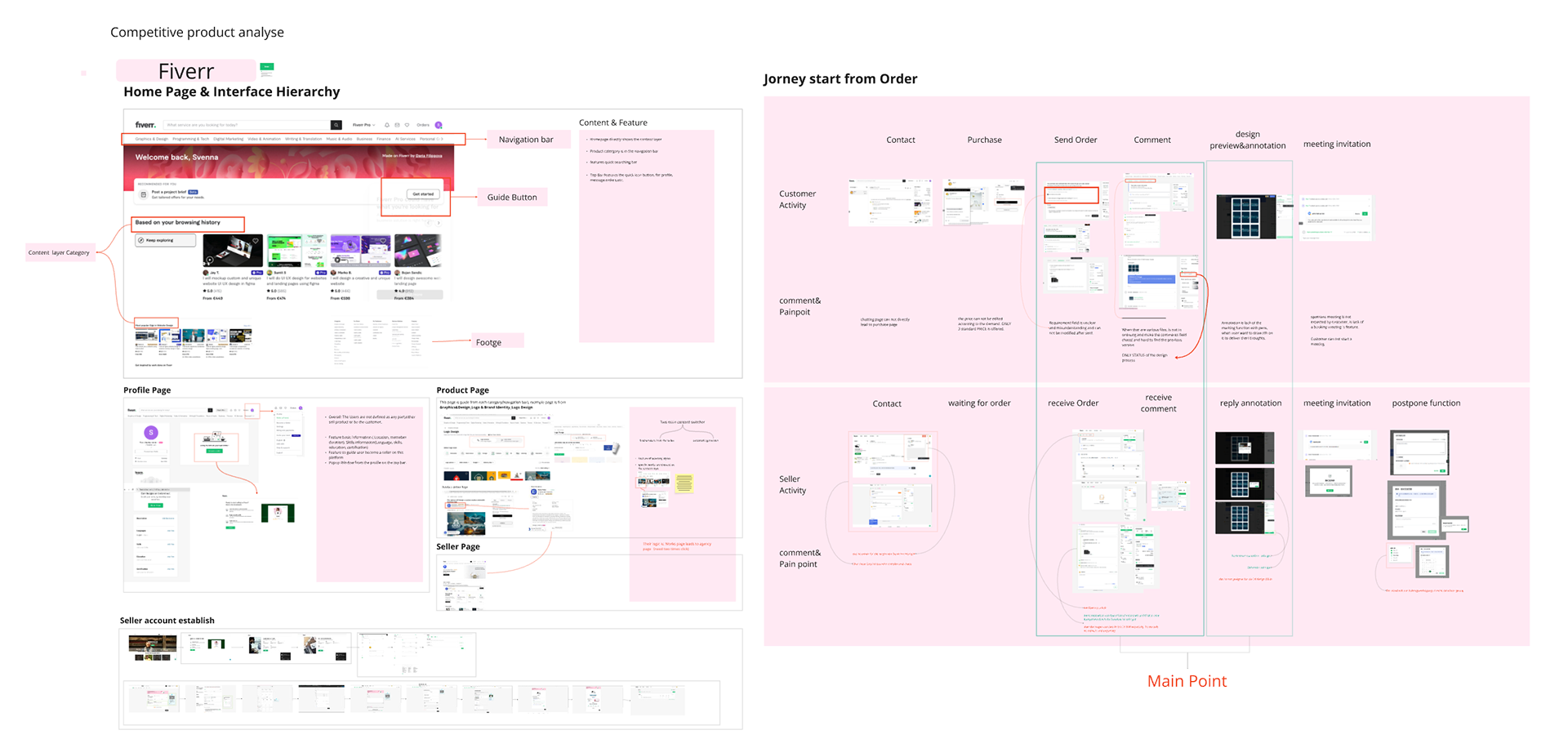
Reference Flow: Fiverr
Based on market research, most design service platforms follow a similar user flow and journey. In this project, Fiverr is used as the primary reference for the “Before” experience, serving as a baseline for targeted UX improvements.
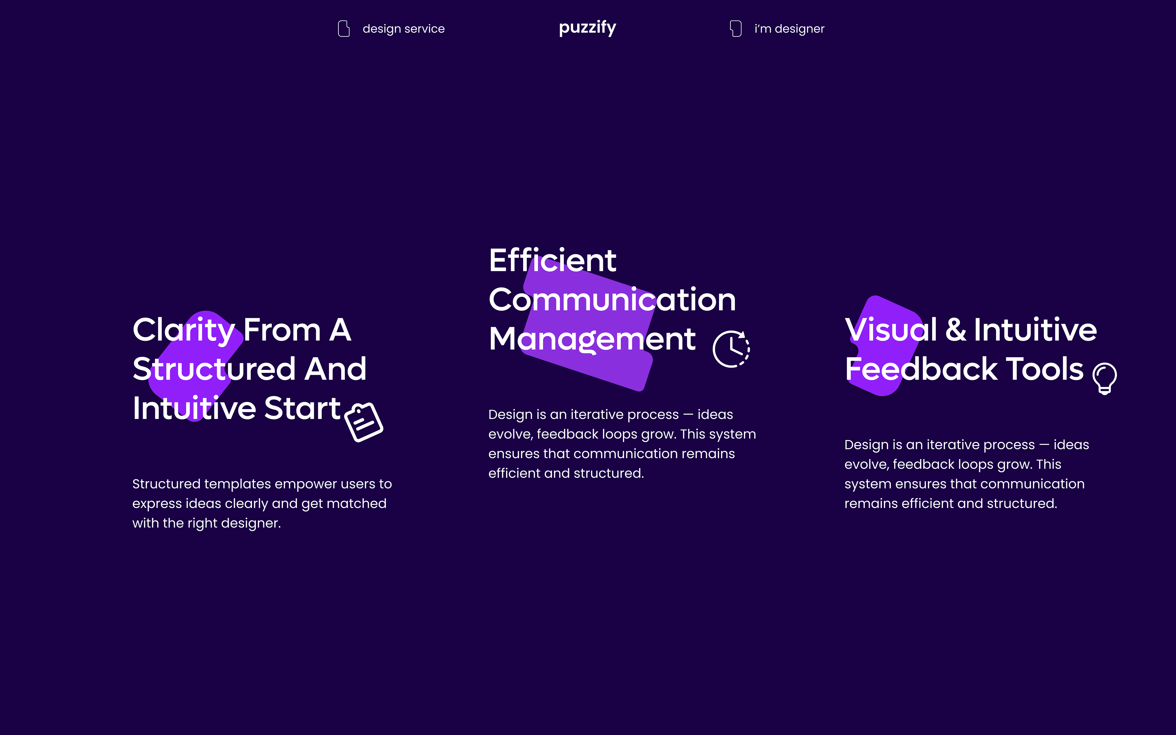
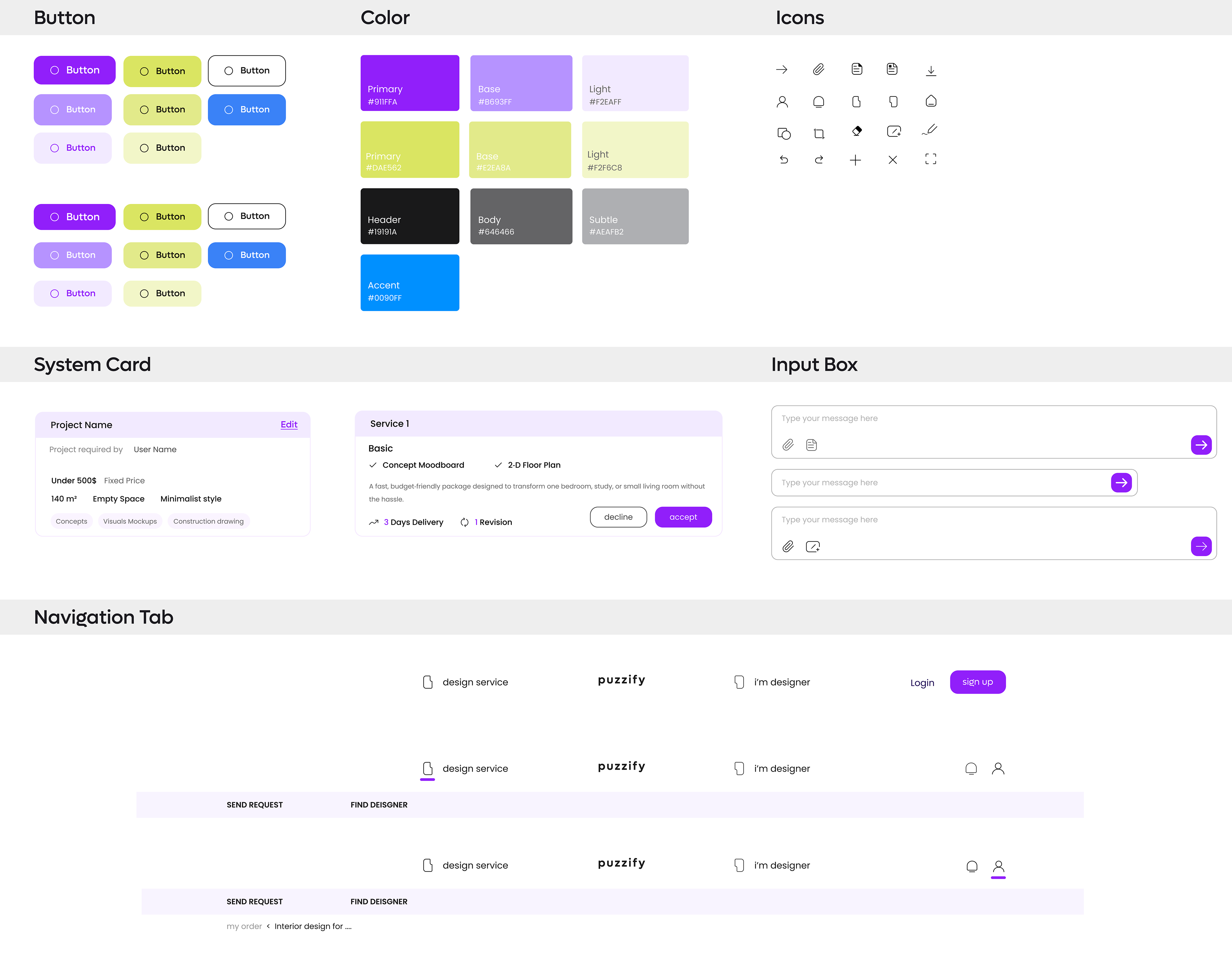
UI Component & Visual Style Guide
The Component System establishes a unified visual language across the platform, ensuring clarity and consistency in every interaction. While maintaining a cohesive look and feel, the system introduces subtle distinctions between user types — designers interact with a green-accented interface, while clients experience a purple-themed variation. This role-based color differentiation enhances usability and reinforces identity, all within a harmonious and scalable design framework.
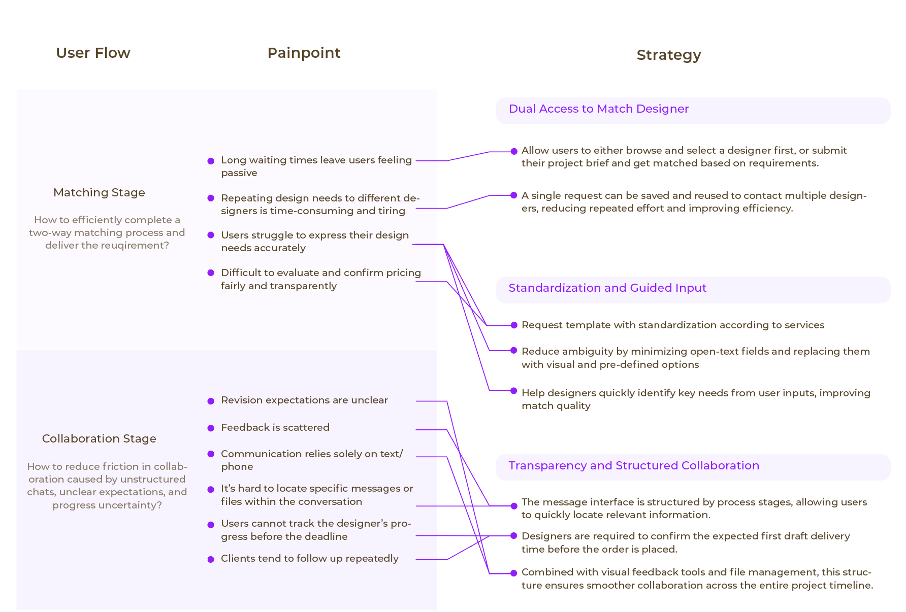
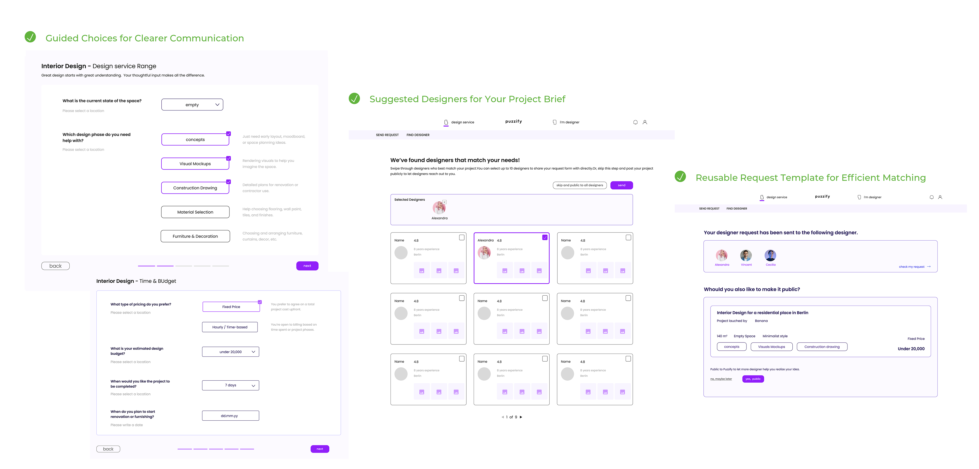
From Scattered Requests to Structured Briefing
Breaking point 1
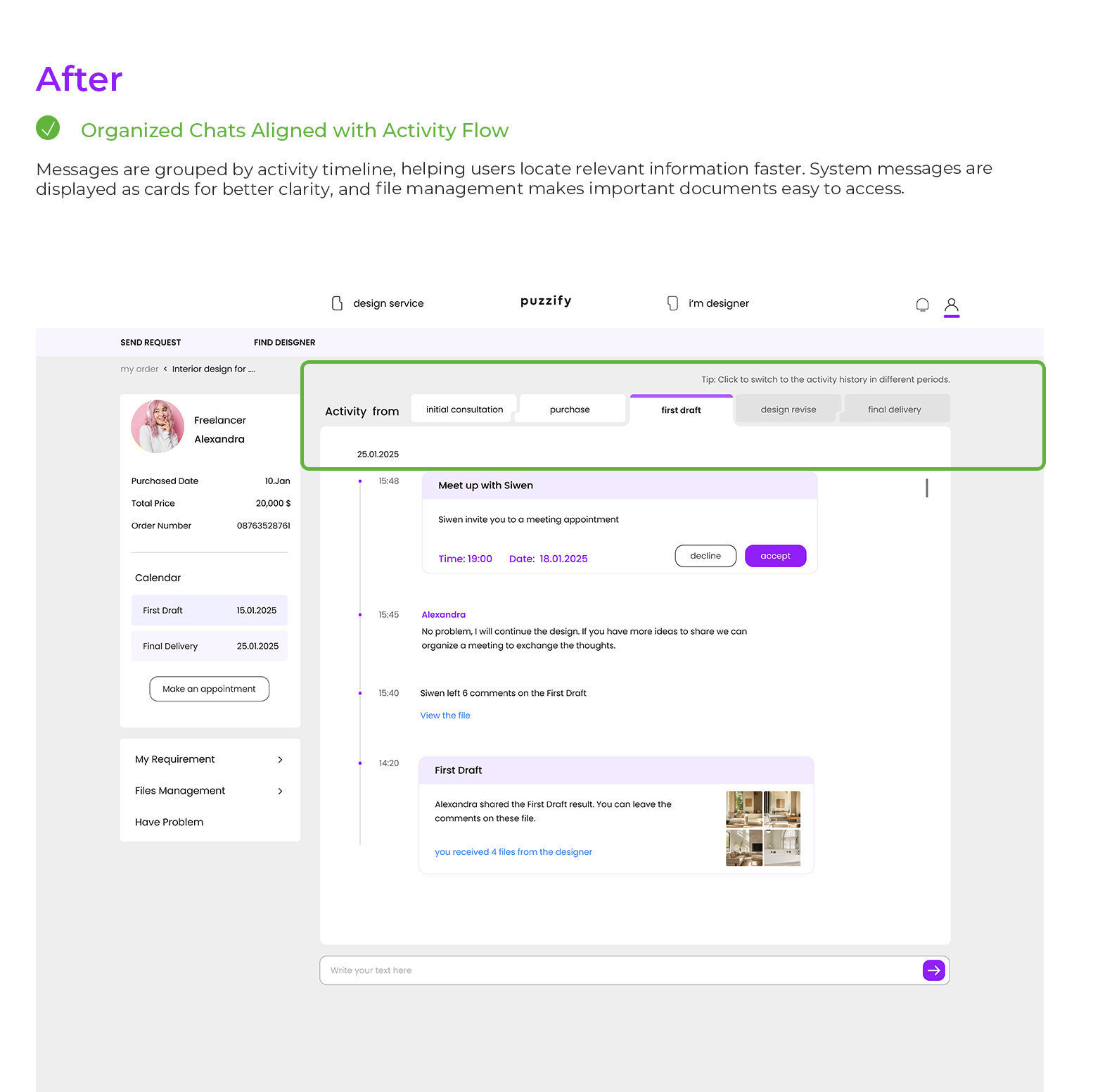
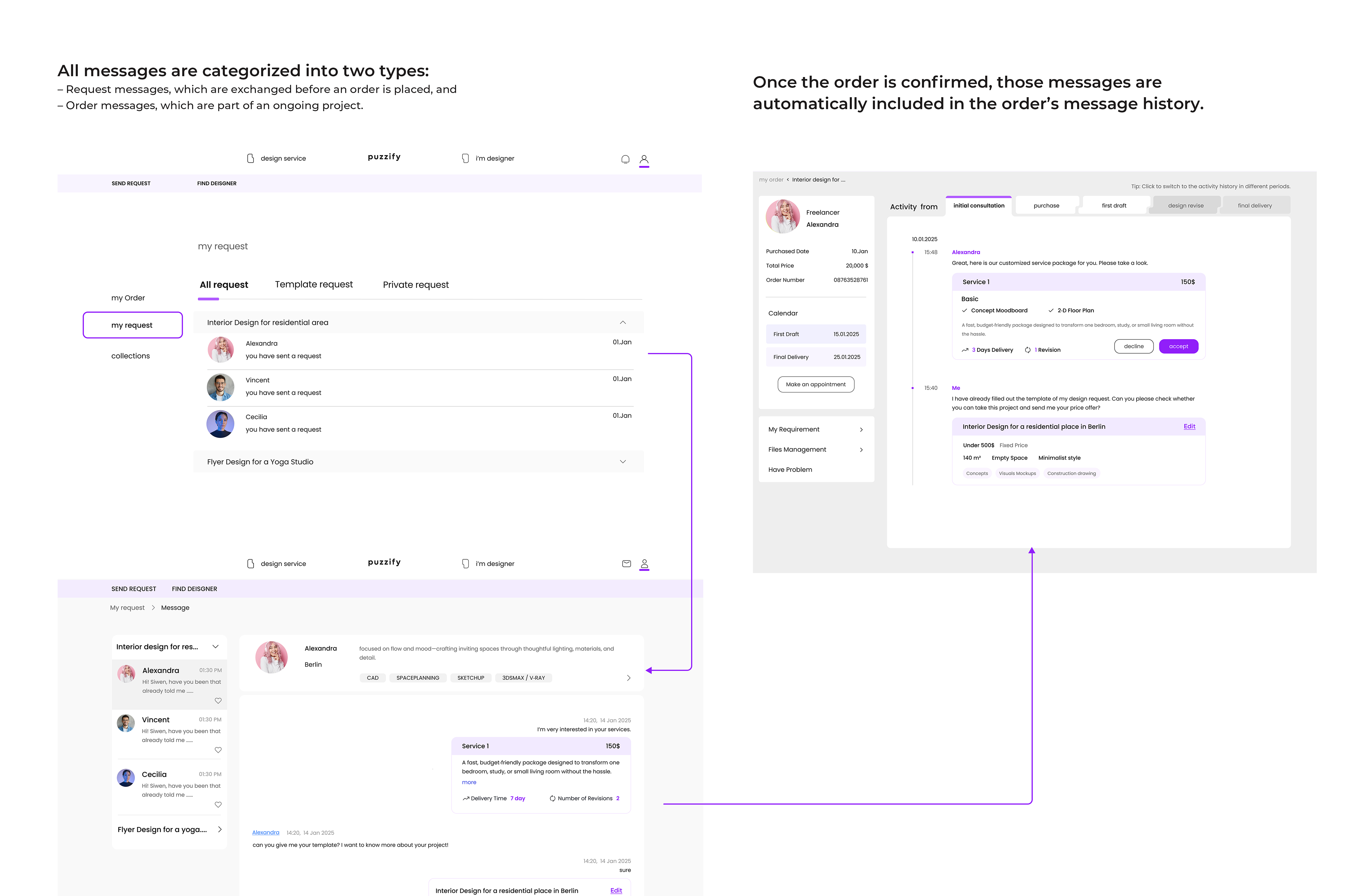
From Message Chaos to Structured Clarity
Breaking point 2

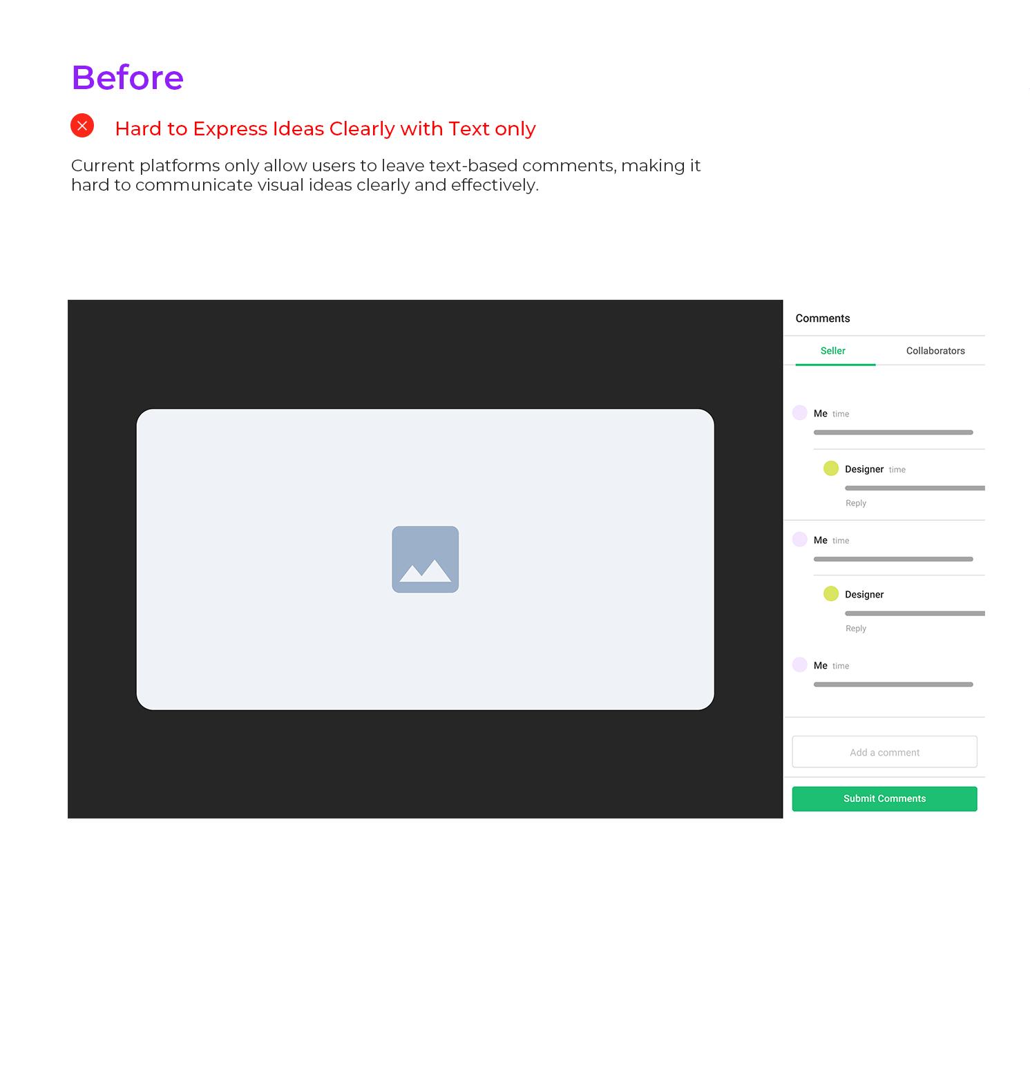
From Text Feedback to Visual Expression
Breaking point 3